Thursday, November 19, 2015

Lab 6 Geometric Correction

The purpose of this lab was to introduce students to the process of geometric correction of satellite images. For this lab I was required to geolocate a Landsat TM satellite image by the use of a USGS topographic map of the corresponding Chicago Metropolitan area. I was also to do a similar process with an image of an area in eastern Sierra Leone.

 Objective one: Image to map rectification

For the first objective of this lab I was tasked with rectifying a satellite image of the Chicago area with Erdas Imagine by the use of Geographic Control Point pairs. I used a first order polynomial for the geometric model which essentially translates the pixels from the image onto a flat plane. While it is not as accurate as using a higher order polynomial to correct the image it did save some time rendering the finished rectified image (accuracy really wasn’t a huge problem anyways, the original image was not terribly distorted).  After specifying to use the USGS topographic map as the reference image I proceeded to add Geographic Control Points (GCP) in places easily identified in both the satellite and the map. Seeing as I was only using a first order polynomial I needed only three GCPs. For good measure I added a forth to help minimize distortion which may have resulted by not distributing the GCPs evenly throughout the map. The below image (Figure 1) shows multipoint geometric correction window I used to place the GCPs. 

Figure 1. Multipoint geometric correction window. Note the similar location of the geographic control point placement in both the satellite image (Left) and USGS topographic map (Right). 

Initially the GCPs were not placed accurately which resulted in a moderately high Root Mean Square Error (RMS), a number derived from the distance formula to help the analyst to accurately place GCPs. After carefully moving the GCPs on the satellite image to better represent the locations selected on the reference map I was able to decrees the RMS from over 4.0 to ~0.31. Once the RMS was decreased to an acceptable level I was tasked to resample the image using nearest neighbor interpolation. The rectified imaged looked essentially the same as the original image with the exception of the pixels being slightly adjusted.

Objective 2: Image to image registration

For the second portion of the lab I was to correct two similar images of a portion of Sierra Leone. Unlike the image used for objective one, this image was noticeably distorted when compared the reference image. So instead of using a fist order polynomial function I used a third order one. Because of this I had to create at least ten GCPs instead of just three. Figure 2 below shows the interface and the GCPs I placed on the distorted and corresponding reference image.

Figure 2. Multipoint geometric correction window showing distorted image left and geometrically corrected reference image right. Locational data for GCPs displayed in table at bottom of image.

I ended up adding 13 total GCPs and was able to reduce my total RMS error to ~0.17 through careful adjustments of the most poorly placed GCPs. Once finished I was ready to run an interpolation process on the image which would make it geometrically correct. Unlike the first image I used a bilinear interpolation method instead of nearest neighbor. I believe this to be a good choice because, due to the distortion of the original image, nearest neighbor would probably loose data from the image. One the process was finished I was quite surprised with how well the accuracy of the resampled image compared to the reference image. When running a swipe tool to compare them I was not able to discern any spatial difference until I magnified both images enough to see individual pixels. And even then the difference was minimal.

 All data used in this lab provided by:
Satellite images: Earth Resources Observation and Science Center, United States Geological Survey.
Digital raster graphic (DRG): Illinois Geospatial Data Clearing House.

Thursday, November 12, 2015

Lab 5: Interpretation of Lidar Data

The learning outcomes for this lab was to become familiar with the manipulation of Lidar Data. The first objective was the introduction of some of the tasks associated with editing raw Lidar data so as to be able to display it within a GIS. Once the data was displayed I learned several simple viewing and conversion techniques to be able to symbolize and understand the data. Finally I was tasked with exporting the data as a raster file. 

Objective 1: Formatting data

At the beginning of this lab I was provided with a point cloud data set which I was able to view in both Erdas Imagine and ESRI ArcMap. Most of the data manipulation was done with ArcMap seeing as it has a slightly better interface than Erdas. But in order to get ArcMap to properly project the data I had to sift through the included metadata file information to find its original datum and unit of measurement for both the horizontal XY axis and Vertical Z axis. After defining this information for the point cloud data by using ArcCatalog I was able to display it within ArcMap.

Objective 2: Viewing the data


Once the data was formatted properly for display in ArcMap I was able to symbolize several aspects of the data. Four common displays are shown below in figure 1, a four panel map showing the same extent some aspects of the University of Wisconsin Eau Claire. The data included all returns with the exception of aspect, which used only the ground returns so as to simplify the data display.
Figure 1. Lidar data symbolized for Elevation, Aspect, Slope, and Contour. 

Elevation is the display of height of the data, in this map the “hotter” colors (reds oranges) are higher than the cooler colors (blues and greens). Slope shows the steepest angles of features as a vibrant red (building walls or trees) and flatter features (rooftops or fields) as green. Aspect is a continuation of Slope but instead of symbolizing the degree of slope it show the direction of the slope. Contour is a display of elevation changes by the use of user defined isoclines. In this case the contour interval was set to five feet. With the index contours set for every five lines.

To help see the how the Lidar interacts with a surface and to display the 3d qualities of a dataset ESRI integrated several featuers into their software, such as the abilitie to take cross sections of an area to see its profile or to even render an area in three dimensions. See the images below (Figure 2-4).

Figure 2. Profile of a railroad bridge using the first return.

Figure 3. Profile view of the South side of Phillips Science Hall on the UWEC campus using the first return. One can see a surprising amount of detail in this image. Note the observatory on the roof of the building and the sport utility vehicle parked several floors directly below it. 

Figure 4. Three dimensional rendering of features of the University of Wisconsin Eau Claire Campus.

Objective 3: Rasterizing Data

For this objective I was tasked with converting the point data from the LAS file to a raster file type. From that raster file I was to make a hill shade image using ESRI software. It was a pretty straight forward process that only involved the use of two tools: “LAS to Raster” and “Hillshade.” The LAS to raster required some parameters to be filled in to work properly but the hill shade tool did not require any special inputs. Below (Figure 5) is a collaborated image of the original LAS file, and the two derived files: raster and hill shade.

Figure 5. A progression of data manipulation from the original LAS point data (first return), to raster, and finally to a hill shade.

Using the same process above I performed a raster conversion and created a hill shade of the same LAS data file as before. The only difference being that I used ground return points instead of first return points (Figure 6).

Figure 6. LAS ground return data converted to raster then hillshaded.

The final part of this lab was to generate an intensity image from the LAS file (Figure 7).

Figure 7. Intensity image produced from LAS data file.

This image was created in a similar fashion as the hill shades above. The difference being that instead of defining the elevation aspect to be converted to raster the intensity strength was used. This shows the most reflective features in the image with lighter tones while the more absorptive features appear darker. 


Thursday, October 29, 2015

Lab 4: Introduction to Erdas Imagine

The first 3 labs of this course were devoted to learning the most basic functions of Erdas Imagine. For lab four I was introduced to some of the more complex and interesting functions which this program is capable of. For example I was required to delineate an area of interest from a large satellite image, manipulate images to enhance their ability to be analyzed, and used graphical modeling to distinguish areas of an image where changes in vegetation have occurred. 

Objective 1:  Image Subsetting

                This objective of the lab involves subsetting an image by the use of the subset and chip function of Erdas Imagine. The first step to using this function is defining an area of interest (AOI) from an Image. There are two simple ways that an AOI can be determined: by using an inquire box (figure 1) or by using a georeferenced shapefile (figure 2). While using the inquire box function is simple the shapfile AOI selection method is advantageous because it can display predetermined boundaries easier and is not limited to rectangular shapes. 

Figure 1. Left: original Image. Right: Inquire box subsetted image. 

Figure 2. Left: original image, note polygons over Chippewa and Eau Claire counties. Right: shapefile defined subsetted image. 

Objective 2: Image fusion

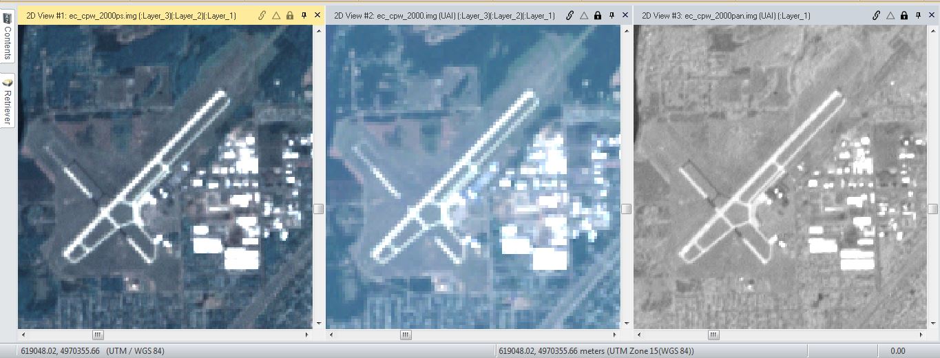
                For this objective I was able to improve the spatial resolution of an image by merging a 30 meter reflective image with a 15 meter panchromatic image. The pixel values were determined by the Erdas resolution merge function set to use a multiplicative algorithm and nearest neighbor resampling technique. One can see the differences between all three images below (Figure 3).

Figure 3. Left: resolution merged (Pansharpened) image. Center: original Multispectral Image. Right: Original panchromatic image.

Objective 3: Basic Radiometric Enhancement Techniques

                With this portion of the lab I used a haze reduction function on Erdas to improve the spectral and radiometric clarity of the image. One can see the improvement of contrast between both images below (Figure 4).

Figure 4. Left: original image. Right: Modified, haze reduced image.

 Objective 5: Resampling

                For this objective I was able to resample the image using both nearest neighbor and bilinear interpolation. There is no difference, aside from the increased amount of pixels, between the original image and the one resampled using the nearest neighbor method. There was a much more pronounced difference between the image resampled using the bilinear interpolation technique and the original. The image is more spatially accurate and many features are smoothed out. One can observe these differences below (figure 5).

Figure 5. Left: original image. Center: nearest neighbor resampled image. Right: bilinear interpolation resampled image. 

Objective 6: Image Mosaicking

                For this objective I was tasked with creating several image mosaics. The first mosaics was created using the Erdas function Mosaic Express. While this technique of image merging was easy to set up and quick to render on the computer the final image left much to be desired (Figure 6). There was not a smooth transition between the images making it quite obvious where the original image’s borders were. One advantage of the function is how the radiometric changes increased the contrast of the output image.  

Figure 6. Left: original images. Right: Erdas Mosiac Express image. 

Objective 7: Image differencing

                This section of the lab was designed to introduce students to the concept of image differencing, a technique used to see changes in one place over time. After opening two images of the same area that were taken 20 years apart I used the Erdas Two Image Functions to perform a binary change detection between band 4 on the images. After running the process no change was apparent in the new image so I was required to manipulate the histogram portion of the image metadata so as to determine the areas brightness changed the most (Figure 8). 


Figure 8. Binary change image histogram.

 In order to better demonstrate the change between the images I was tasked to use Erdas Model Maker to put together a basic model for determining the change in brightness vales between the images. After running a two basic operations with the model maker I was able to isolate the pixels in the image which had changed the most (Figure 9).  

Figure 9. Left: subtracted values between 1991 and 2011 images. Right: Highlighting of pixels that had the most change in brightness values.

 The final operation for this lab is to display the brightness values from the last step on a contrasting base map. I used ESRI ArcMap to complete this task. Unfortunately due to time constraints I was not able to get it to look as nice as I would have liked to (Figure 10).


Figure 10. Completed map showing binary change.